Eclipse Dance Studio
A hypothetical study of a self created dance studio that required a full branding strategy.
The branding
Everything starts with the logo. So. Here’s the logo.

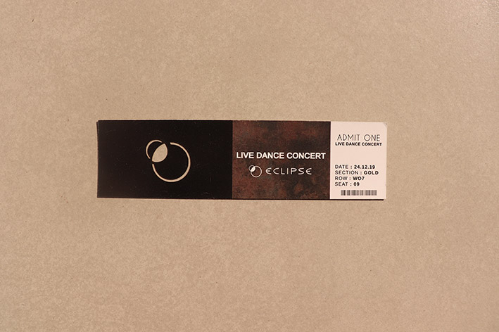
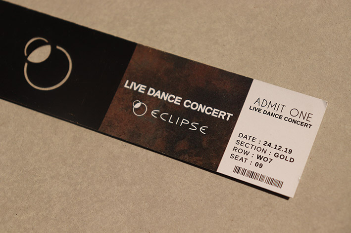
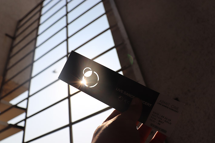
Specially designed logotype and symbol for Eclipse dance studio. The logotype is transfigured to attain the curvilinear features of an ellipse.
The colour? Yep. Minimal, sleek. modern, black. Seemed like the appropriate use of elements to go with the nature and core of the people of the studio. The face of the studio is their people after all.
Of the Deliverables
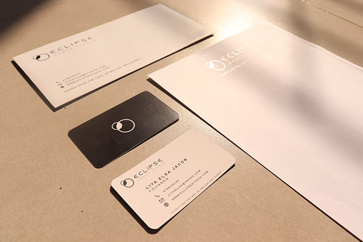
The deliverable table includes the letterhead, business card and envelope trinity;
Brand Manual
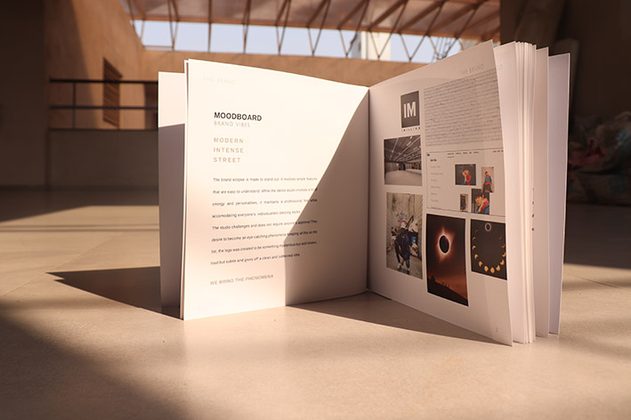
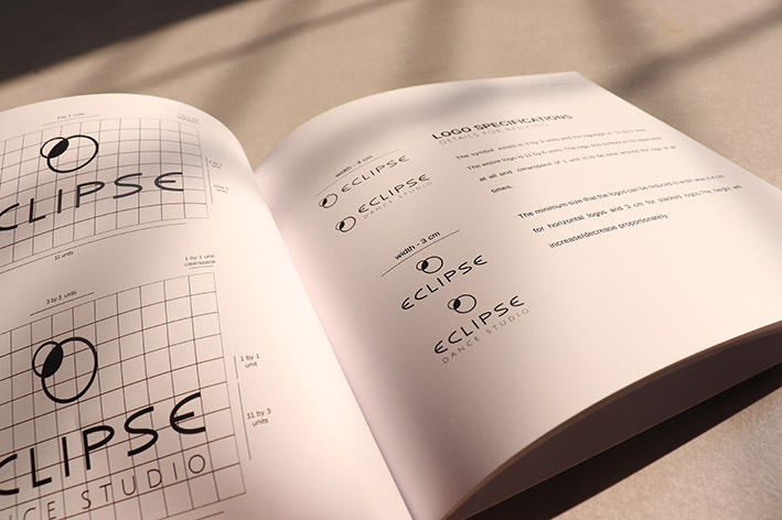
The brand manual entailing the details of of branding : The logo size and colour, branding elements, mood boards and other branding properties.

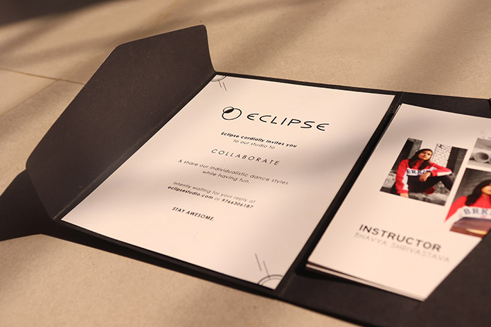
Invite + Photocard
A collaboration invitation to invite popular individuals to collaborate with the studio. It includes instructor photocards that reveals the personal vibes of the instructors;
Photography
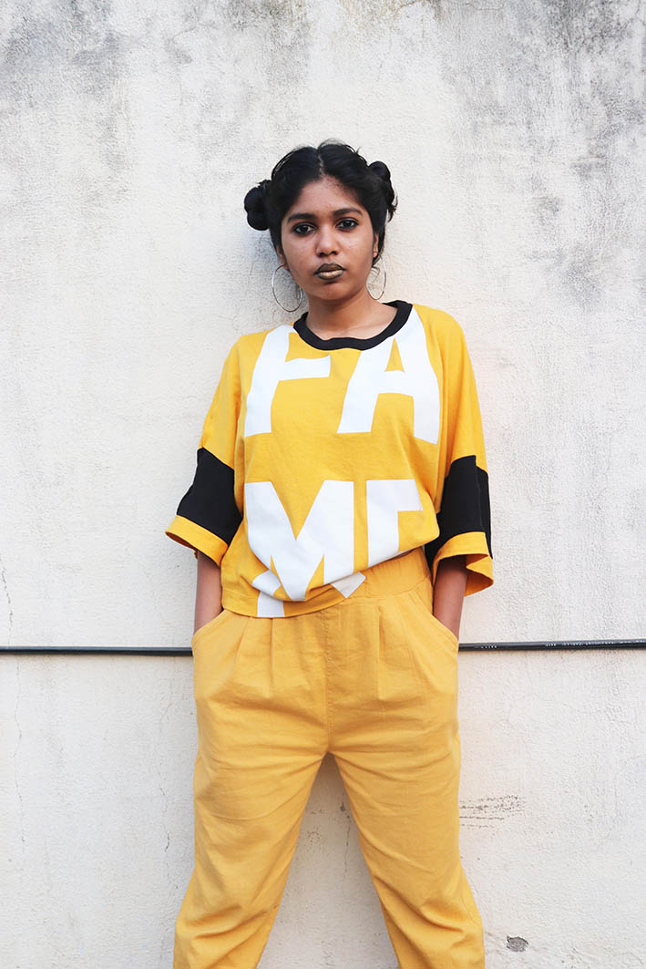
The people are the brand.
The instructors embody the brand. Therefore, one must brand the people in order to brand the studio. For modelling purposes, I’d like to credit Amit Vinod Chand, Bhavya Srivastava, Muskan Pai and Shruti Pradeep Mane for stepping in as models for the hypothetical dance studio instructors.
Shruti Pradeep Mane (Instructor)
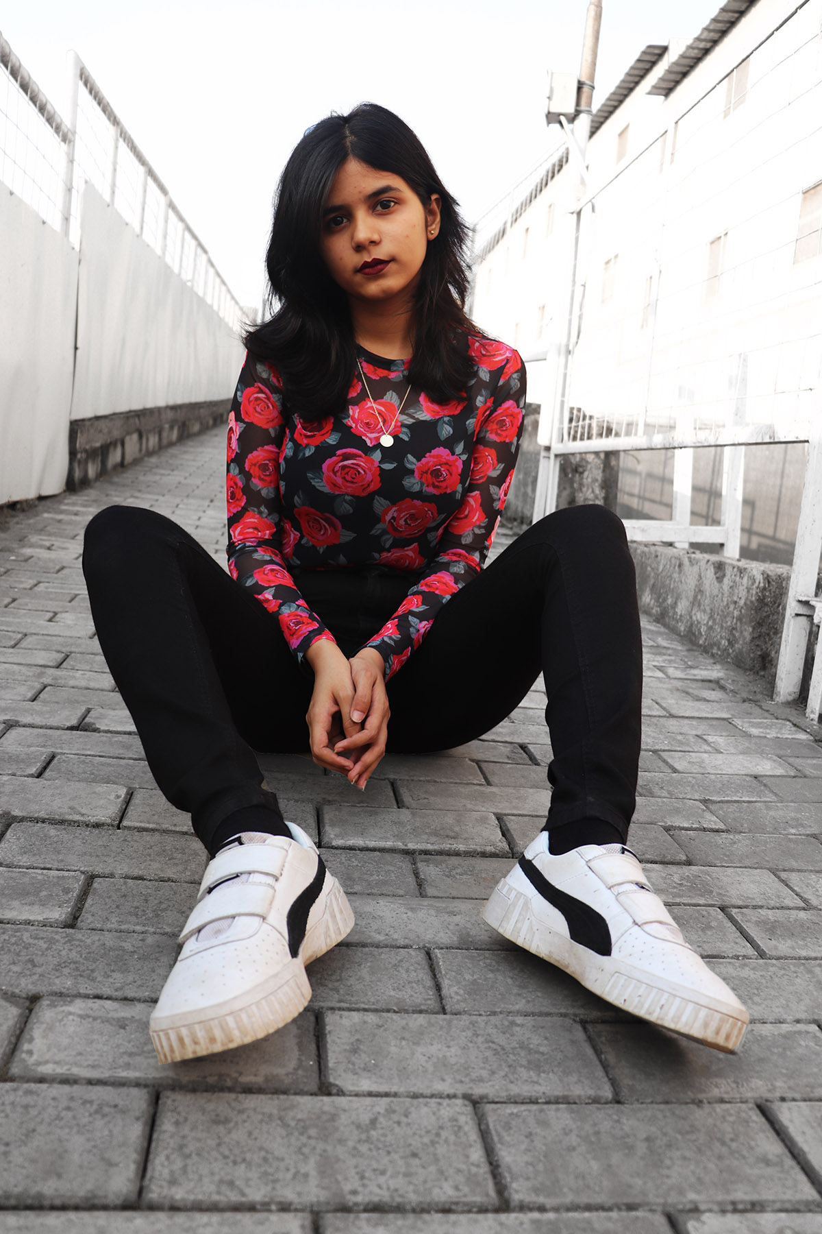
Salsa Instructor
Muskan Pai
Instructor
Amit Vinod Chand
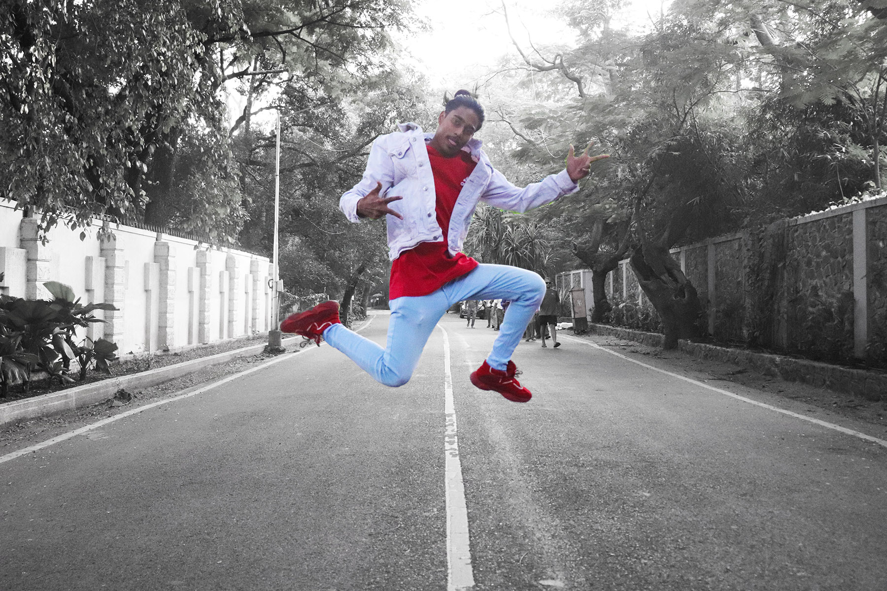

Hip-hop Instructor
Bhavya Srivastava
Website
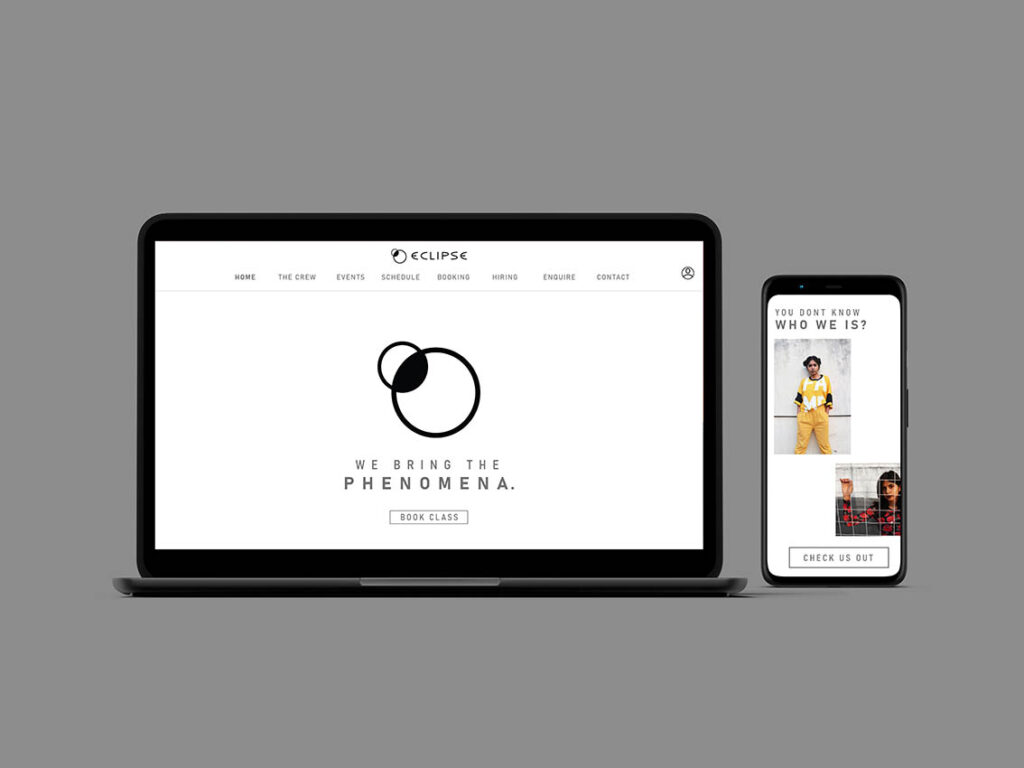
For the final deliverable, mobile and desktop versions of the website was carefully organised, layouted and colour constructed on adobe XD.
